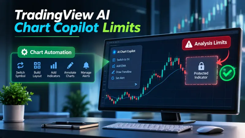
A TradingView dashboard is a table drawn in the corner of your chart, and every cell in it has a price. The price isn't money. It's a data request, and the platform gives each script a fixed number of them. Once you know that number, the grid size on a product page stops being a feature and becomes a clue about what the author had to give up.
This post does the arithmetic the product pages skip. It also covers the three ways a dashboard can live inside the limit, the repainting problem that makes a confident-looking table provisional, and the questions worth asking before you pay for one. Quantzee sells indicators for TradingView, so read our section near the end with that in mind.
What a TradingView dashboard actually is
Strip away the styling and a chart dashboard is a Pine Script table. The script reads values from somewhere, usually from other symbols or other timeframes, and prints them in rows and columns in a corner of the pane. Trend arrows, RSI readings, a "bullish" or "bearish" tag per timeframe. That's the whole trick.
The reading part is where the cost sits. A script can only see the chart's own symbol and timeframe for free. Anything else arrives through the request.*() family of functions, and request.security() is the one dashboards lean on. Each of those calls fetches a separate stream of data, and the platform meters them.
So a dashboard with 10 symbols across 7 timeframes isn't "a table with 70 cells." It's a script that needs up to 70 different streams of outside data. Hold that thought, because the product listings never do.
The ceiling, stated properly
According to the official Pine Script documentation on limitations, read on 18 November 2026, a script can use up to 40 unique calls to the functions in the request.*() namespace, or up to 64 unique calls if the user has the Ultimate plan. So the figure is 40 on most plans and 64 at the top tier. Quoting "40" alone is wrong, and so is quoting "64" alone.
Two details from the same page matter for dashboards. First, identical calls are not counted twice. When a script runs two or more request.*() calls with the same arguments, only the first usually counts toward the limit, because the repeats reuse the data from the first. Second, library functions that contain request.*() calls in their own scope do count, even if your main script already makes the same call. A dashboard built on an imported helper can burn budget you didn't see it spend.
The ceiling is also a per-script number, not a per-chart number. That's why you'll meet people who run two dashboard scripts on one layout to get around it. It works, and it costs you in load, which we'll get to.
Source: the TradingView Pine Script documentation, "Limitations" page, section on request.*() calls. If TradingView changes the plan tiers, that page is where the new numbers will appear first.
The arithmetic on a real advertised grid
Take a dashboard product that advertises scanning 10 symbols across 7 timeframes. One such page is the Logic Day Trading Dashboard sales article on indicatorvault.com, which says it shows patterns on up to 10 symbols and 7 timeframes at a glance. We compared that claim against the ceiling, and the sums are short.
- 10 symbols × 7 timeframes = 70 symbol-and-timeframe pairs.
- Each pair needs its own data stream, so the script wants about 70 unique requests.
- The standard ceiling is 40. The top-tier ceiling is 64.
- 70 is over both. Even the Ultimate plan falls 6 short.
That doesn't prove the product is broken. It proves the product can't be doing the obvious thing. Either the author found a way to pack the work into fewer requests, or some cells are filled differently from the others, or the advertised grid is a ceiling on paper and not what runs on a standard plan. The page we read doesn't say which, and it doesn't mention the request limit at all.
The same sums work for any grid, so here is the table you can use on your own. Pairs are symbols multiplied by timeframes.
- 5 symbols × 6 timeframes = 30 pairs. Fits under 40.
- 8 symbols × 5 timeframes = 40 pairs. Exactly the standard ceiling, with nothing left for any other request in the script.
- 10 symbols × 4 timeframes = 40 pairs. Same story.
- 9 symbols × 7 timeframes = 63 pairs. Fits only on the 64 tier, with a single request to spare.
- 12 symbols × 6 timeframes = 72 pairs. Over both.
Notice how little room the 40 tier leaves. A dashboard also needs the chart's own data and sometimes an extra request for something like the current symbol's session or a currency rate. Every one of those comes out of the same budget. A traderspost.io article on building a multi-symbol dashboard recommends keeping to roughly 10 to 15 symbols, which tells you where the working limit sits once a script does anything else.
Architecture one: pack the values into one request
The legitimate way to build a large table is tuple packing. A single request.security() call can return several values at once, as a tuple, for one symbol on one timeframe. The reference material we read agrees on this, including the tradingcode.net error-message page and the traderspost.io article, which confirms that a tuple counts as one call.
So a column that shows trend direction, RSI and ATR for one symbol on the 4-hour timeframe costs one request, not three. That's how a table with 40 cells of data in it can stay inside a 40-request budget.
Here is the catch, and it's the one people miss. Packing values buys you more measures per pair. It does nothing for the number of pairs. A request is tied to one symbol and one timeframe. If you want 10 symbols on 7 timeframes, packing lets each of the 70 pairs return five indicators, but you still have 70 pairs. The grid size is set by pairs, and pairs are what the ceiling counts.
This has a visible consequence in the finished table. Every value in a packed cell shares that cell's timeframe. You can't have RSI on 15 minutes and trend on 4 hours in the same request. If a dashboard shows several measures for a symbol, check whether they all describe the same timeframe, because that's usually the packing showing through.
Architecture two: tier the budget and accept stale cells
The second honest option is to spend the budget unevenly. A short list of symbols you actually trade gets many timeframes. A longer watch list gets one or two slow timeframes, where the value changes rarely anyway.
Say you have 40 requests. You might give 4 core symbols 6 timeframes each, which is 24 pairs. The remaining 16 pairs go to 16 more symbols on one timeframe, probably the daily. You've got a 20-symbol table, which looks much bigger than a flat 10-by-4 grid, and you paid for it with depth.
What the user sees is a cell that's correct but old. A daily-timeframe cell changes once per session at most, so it can sit unchanged for hours while the short-timeframe cells beside it flicker. That's not a bug. It's the trade the author made, and a dashboard that doesn't tell you which cells are which has hidden the trade from you.
When you evaluate one, ask which rows refresh on every bar and which don't. A tiered dashboard that labels its slow cells is honest. One that colours them the same as the fast ones is quietly overstating how current the table is.
Architecture three: stop using a script and use the screener
The third option is to give up on a chart dashboard for the wide-net job. TradingView's Pine Screener runs a Pine indicator across a list of symbols and puts the plotted values in a table. That's the right shape for "rank 200 symbols on one or two conditions," and the wrong shape for "watch 5 symbols on 8 conditions."
We went to the official support page for the screener, because third-party sources disagree about its request quota and the figure is easy to get wrong. According to TradingView's "Pine Screener: key features and requirements" page, read on 18 November 2026, the screener supports all request.*() functions with limitations, and the first limitation is that no more than forty separate request.*() calls can be used inside the scanned script.
So the screener quota, on that page, is the same forty as a standard-plan script. It is not a separate and tighter number. What does change are the other terms:
- Only plots of the selected indicator become table columns.
- The supported timeframes are fixed: 1, 5, 15 and 30 minutes, 1, 2 and 4 hours, 1 day, 1 week and 1 month. Custom timeframes aren't supported.
- You can run one scan at a time. A second browser tab can't start a concurrent scan while one is running.
- The indicator calculates on the last 500 bars only, and
input.timeframe(),input.symbol()andinput.time()aren't supported, so those inputs fall back to the script's defaults.
The reason the screener scales to many symbols is structural. It runs the same script once per symbol on the list, so the symbols don't multiply your request count the way they do inside a chart dashboard. Timeframes still do. If your scanned script asks for three other timeframes, that's three requests per symbol and it stays comfortably under forty.
That's our reading of how the page fits together, not a line quoted from it. The page states the forty-call limit and the supported timeframes; the "once per symbol" behaviour is how a screener has to work, and we haven't measured its run time. The practical takeaway holds either way: a chart dashboard is a few-symbols, many-conditions tool, and a screener is the opposite.
Repainting: the problem that's worse on a dashboard
The request ceiling is a hard wall you hit with an error. Repainting is softer and does more damage, because nothing tells you it's happening.
A dashboard cell that reads a higher timeframe reads a bar that hasn't closed. On a 15-minute chart, a cell showing the 4-hour trend is reading a 4-hour bar that may have 3 hours left to run. The Pine documentation describes the behaviour: with the default settings, the request returns the developing value on realtime bars and the last confirmed value on historical bars. In plain terms, your backtest of that cell looked at closed bars and your live chart is looking at open ones.
The pineify.app write-up on request.security() states the same thing, that an unconfirmed live higher-timeframe bar can still repaint. A table makes it worse because a table looks finished. A row of green "bullish" cells reads as agreement across timeframes, but if three of those cells are reading open bars, the agreement is provisional and can vanish when the bars close.
You can check this on any dashboard you already own. Load it on a replay or a live chart, note a cell that's reading a higher timeframe, and watch it through the close of that higher bar. If it changes colour at the close, it was repainting. Our step-by-step method is in how to test a TradingView indicator for repainting, and the wider picture of what counts as non-repainting is in our guide to non-repainting TradingView indicators.
The fix, where an author applies one, is to make higher-timeframe cells wait for the close and show the last confirmed value. The cost is a table that lags the developing bar, which some traders hate and others find calmer. Either choice is fine. Hiding the choice isn't.
The practical tax: lag and load
Staying under the ceiling isn't the end of the cost. Every external request takes execution time and memory. A script sitting at 38 or 39 requests will redraw more slowly than one using 12, and on a busy layout, with other indicators and a replay running, it's the one that times out or throws a runtime error.
It's why splitting a dashboard across two scripts to dodge the ceiling is a poor deal. You get the grid, and you pay with a slower chart. A table that takes a noticeable moment to refresh after a symbol change has usually been built right up against the limit.
A few signs that a dashboard is running hot: the table appears a second or two after the candles, cells go blank on a fast-moving bar, or the script drops off the chart with a warning when you add one more indicator. None of that is proof on its own, but together they point at the budget.
What to ask before buying a dashboard
Here's the short list. A seller who can answer all four has thought about the problem.
- How many symbols and timeframes at once, on which plan? Get the pair count and compare it with 40 and 64 yourself.
- Do the higher-timeframe cells wait for the close? If not, the table is provisional until the bar finishes.
- Do the values repaint? Ask for the answer in terms you can test, not a slogan.
- What happens when the request cap is reached? A good dashboard degrades on purpose, dropping the slowest rows first. A bad one errors out and shows nothing.
The Logic Day Trading Dashboard article we compared earlier prices a single indicator at 19.99 and a two-item bundle at 31.99, on the page as read in November 2026. It answered none of the four. That isn't a verdict on the product, only a note that the page is selling the grid and not the engineering behind it.
Where our own toolkit's dashboard sits
Quantzee's AI TrendPulse has a dashboard, so it's fair to describe it in the same terms. We'll stick to what our own documentation says, because that's the only version of the claim we can stand behind.
The AI TrendPulse documentation page describes a table that reports the trend phase (Impulse, Cooling, Neutral or Reversal risk), a Slope Power score from 0 to 100, and a confidence reading, and lets you move the table to a different corner of the chart. It also states that the indicator doesn't use security() with lookahead, and that its signals appear at candle close and stay fixed. That page describes a readout built from the chart's own data. It doesn't describe a multi-symbol, multi-timeframe grid, and we won't imply one.
That puts it on the other side of the trade-off from the 10-by-7 products. It watches one chart in depth, and it doesn't try to be a wide scanner. If you want a wide scanner, the screener route above is the better tool. If you want to see how we handle higher-timeframe context without writing the code yourself, our article on a multi-timeframe strategy without Pine Script goes through it, and the AI TrendPulse setup and settings guide covers the table itself. Quantzee is analytical software, not advice, and none of this tells you what to trade.
If you'd rather write your own dashboard and now know the budget you're working with, our comparison of Pine Script alternatives covers the options. And if you're still choosing between tools, the guide to choosing a TradingView signal tool is the place to start.
How we checked this
The methodology is simple, and we'd rather state it than imply more. On 18 November 2026 we read the Pine Script documentation pages on limitations and on other timeframes and data, and the official Pine Screener support page. We took every quota figure from those pages and from nowhere else. We then read the advertised grid on one product page and ran the multiplication ourselves. We didn't install or run any third-party dashboard, and we haven't measured redraw times, so the lag section is described in general terms and not as a benchmark. Plan tiers and limits change, so check the pages linked below before relying on a figure.
Frequently Asked Questions
request.*() calls, or 64 on the Ultimate plan, according to the Pine Script documentation. Each symbol-and-timeframe pair needs its own call, so 40 calls cover 10 symbols on 4 timeframes, or 5 symbols on 8.request.*() calls can be used in the scanned script. The screener differs in other ways, including a fixed list of supported timeframes, one scan at a time and a 500-bar calculation window.Sources read on 18 November 2026: the Pine Script limitations page, the other timeframes and data page, and the Pine Screener requirements page. Also read: tradingcode.net on the too-many-requests error, Pineify on request.security(), TradersPost on multi-symbol dashboards and the Logic Day Trading Dashboard article.