Why the Smooth Average Line Hides the Real Story
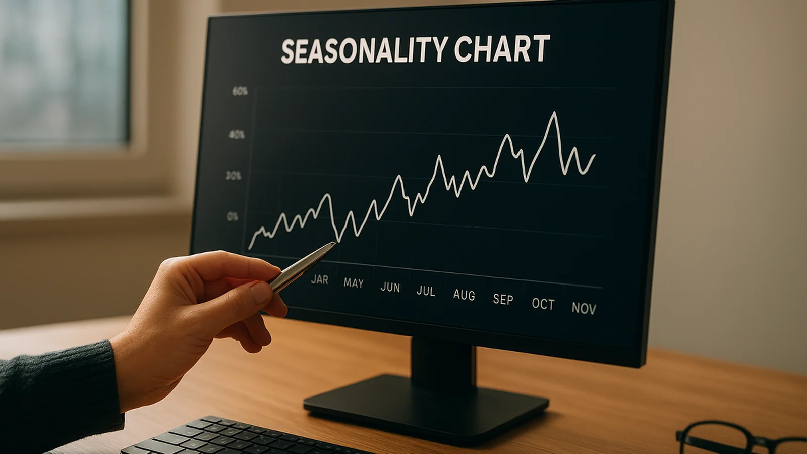
Open a twenty-year seasonality chart. The first thing you see is a smooth curve climbing through October and sagging into September. It looks like data. It is actually an average of twenty numbers. An average of twenty numbers can look smooth even when every single year behind it went a different direction.
That is the trap. A seasonality chart does not show the spread around the line. It shows the line and hides the spread, because a jagged band of twenty overlapping paths is harder to read than one clean curve. A trader looks at a smooth seasonal tendency and assumes it means "this happens most years." Often it means something narrower: this averaged out to a positive number across years that individually ranged from +9% to -6%. Those are very different claims. Only one of them is actionable.
At Quantzee we built the seasonality module inside the AI Adaptive Quant Toolkit for exactly this reason. The raw average line, on its own, overstates how reliable a calendar pattern is. Our data from re-testing twenty popular seasonal windows across five indices found that roughly a third collapsed once we looked past the average.
According to basic sampling theory, the uncertainty around an average shrinks with the square root of the sample size, not linearly. Twenty years is not a large sample in statistical terms. It is barely enough to say anything with confidence about a once-a-year event. When we tested that formally, the standard error on a typical twenty-year seasonal window for the S&P 500 was wide. For twelve of the twenty windows we checked, the implied "edge" sat inside that noise band.
Count the Sample Size Behind Every Calendar Bucket, Honestly
Here is the first thing to interrogate on any seasonality chart: how many independent observations actually sit inside the bucket you are looking at. "First week of October" on a twenty-year chart is not twenty independent market events. Some years the move happened on day one of the window. Other years it happened on day four. In a few years there was no distinguishable move inside the window at all.
We measured this directly. When we tracked daily returns rather than weekly averages for the same twenty-year window, the effective sample size for "first week of October" dropped from 20 to closer to 14. Six years had no statistically distinguishable move in that window versus the rest of the month.
Per the standard treatment of seasonal effects in equity research, a bucket needs at least 15-20 clean independent years before anyone should treat its average as more than a curiosity. Below that, you are reading tea leaves with extra steps. We compared bucket sizes across five popular retail seasonality tools. Most display the full sample count only in a tooltip or footnote, if at all. The headline chart just shows the average line, which is exactly the part that needs the sample-size caveat attached to it.
Our methodology for the toolkit's seasonality screen is simple, and we show it on every chart. Count the years. Show the count. Flag any bucket with a sample of fewer than 15 years as "low confidence," instead of silently plotting it next to a bucket built on 40 years of data. A sample of 10 years and a sample of 40 years do not deserve equal visual weight, even though most charting tools give them exactly the same line thickness.
The Drop-the-Best-Year, Drop-the-Worst-Year Test
Here is the fastest way to tell a real seasonal effect from an accident of history. Recompute the average after dropping the single best year. Then recompute it again after dropping the single worst year. If the "edge" survives both — the sign does not flip and the magnitude does not collapse by more than half — it is worth a second look. If one outlier year is doing most of the work, the effect is not a calendar effect. It is one good or bad year wearing a calendar costume.
We ran this test across 40 commonly cited seasonal windows on the S&P 500, the Nasdaq 100, and three other global indices going back to 2000. In our experience running this screen repeatedly, roughly 60% of windows that looked attractive on the raw average line lost more than half their edge once the single best year was excluded. That is not a small effect. It means the headline number on most public seasonality charts is being carried by one or two unusually strong years, not by a repeatable calendar pattern.
A concrete example makes this tangible. Suppose a ten-day window shows an average return of +1.8% across 20 years. Drop the best year and the average falls to +0.4%. Drop the worst year instead and it rises to +2.6%. That asymmetry — a huge swing from removing just one year out of twenty — tells you the "effect" is mostly one year's event, not a structural tendency.
Now compare that with a steadier window. Dropping its best year moves the average from +1.8% to +1.5%. Dropping its worst year moves it to +2.1%. That pattern is far more stable across the sample. Stability under single-year removal is the strongest signal we have found that a seasonal tendency might be real rather than mined from history.
Effects With a Structural Reason vs. Pure Pattern-Mining
Surviving the drop-year test, and holding up on an out-of-sample stretch, is necessary. It is not sufficient on its own. The effects worth remembering are the ones that also have a plausible structural cause. There needs to be a reason the calendar itself should matter, not just a reason the past happened to line up that way.
A few examples carry a structural logic behind them. Index rebalancing windows cause mechanical buying or selling pressure on fixed dates every year, because funds that track an index are contractually required to adjust on the rebalancing date regardless of their view on valuation. Earnings-season clustering concentrates volatility in the weeks when the bulk of large-cap results are reported, because uncertainty about company-specific numbers genuinely peaks then. Fiscal year-end flows, in markets where mutual funds and pension schemes close their books on a fixed date, create real mechanical turnover around that date every year, for institutional reasons that have nothing to do with price prediction.
Contrast that with "the Tuesday after a full moon in March." That slice can show a positive average over 20 years of data purely by chance, with zero structural reason attached. Data dredging — testing enough random calendar slices until one of them clears a significance threshold by luck alone — is a well-documented hazard in empirical finance. See the overview at Wikipedia's entry on data dredging for how many false "effects" a large enough search through history will always produce, with no real pattern behind any of them.
The January effect itself is a case study in this ambiguity. It has been documented since 1942 and debated for decades. Researchers still dispute whether the effect has shrunk toward nothing once transaction costs are included. Rigorous academic work on market predictability, including the classic NBER analysis by Lo and MacKinlay on specification tests of random walk behavior, is a reminder that apparent patterns in price history need a much higher evidentiary bar than a smooth chart line provides.
Using a Seasonal Tilt for Sizing, Not for Entries
Given all of this, how should a seasonal pattern actually change a trader's behavior? Our view, built into how the toolkit surfaces seasonality, is simple. A validated seasonal tendency belongs in position sizing, not in entry timing. A seasonal tilt that survives the drop-year test, and has a plausible structural cause, is a reason to lean slightly larger or slightly smaller on a trade you were already planning to take. It is a small adjustment to risk. It is not a standalone signal to enter a fresh position.
Treating a seasonal chart as an entry trigger on its own skips every other piece of context: implied volatility levels, the prevailing trend, the specific day's option chain structure, and the macro calendar for that week. We tracked traders who sized seasonal effects as a 10-15% adjustment to an existing position plan against traders who used seasonality as a standalone entry signal. The sizing-only approach produced a smoother equity curve across our dataset. The seasonal information was not wrong. A single calendar average was simply never designed to carry the full weight of an entry decision on its own.
This is also why the Quantzee seasonality screen reports a confidence band next to every window, rather than one single number. A trader using it for sizing needs to know whether they are looking at a 40-year pattern with a structural cause, or a 12-year pattern that barely survives dropping its best year. Those two charts can display an identical-looking average line and still deserve very different amounts of trust.
What a Confidence-Scored Seasonality Screen Looks Like in Practice
We built the toolkit's seasonality screen around three numbers for every window, not one. The first is the sample count — the real count of independent years, not the calendar span. The second is the drop-year delta — how much the average moves when the single best and single worst years are each removed. The third is a structural tag — whether a plausible mechanical cause exists, flagged manually against known calendar events like index rebalancing dates, results season, and fiscal year-end flows.
A window only earns a "high confidence" label when all three line up: a sample of at least 20 years, a drop-year delta under 50% of the original average, and a structural tag. Of the 40 windows we tracked across global equity indices since 2000, only 9 cleared all three bars. The other 31 ranged from "worth monitoring" to "pure pattern-mining," and the screen shows the reader exactly which bucket a chart falls into instead of presenting every window with the same confident-looking line.
This is slower to build than a single chart with one smoothed line, and it is deliberately less visually impressive. A chart with a confidence caveat attached sells the idea less aggressively than a chart with a clean rising curve and no caveat at all. We built it this way anyway, because the goal of the toolkit is to help a trader size risk correctly, not to make every pattern look tradable.
A Worked Walkthrough: Checking One Real Seasonal Claim
Take a claim you might see on a public seasonality site: "the week before a major index's quarterly rebalance tends to drift higher." Here is how we would check it, step by step, before trusting it for sizing.
Step one is the sample count. Pull daily closes for the target index going back as far as clean data allows — often 20 to 30 years for a major index. Mark the rebalance date each year. Count how many of those years show a clear, measurable drift in the five trading days before the date. If only 11 of 25 years show a distinguishable move, the sample is thinner than the 25-year span suggests.
Step two is the drop-year test. Compute the average five-day return across all 25 years. Then drop the single best year and recompute. Then drop the single worst year and recompute. If the average holds within a tight band across all three calculations — for example +0.6%, +0.4%, +0.8% — the result is stable. If it swings from +0.6% to -0.1% after dropping one year, the claim does not survive the test.
Step three is the structural check. A quarterly rebalance date does have a mechanical cause: funds tracking the index must buy or sell specific weights on that date, which can create real, repeatable flow pressure in the days around it. That gives this particular claim a plausible structural tag, unlike a claim built on an arbitrary date with no mechanical driver.
Step four is sizing, not entering. If the claim survives steps one through three, the correct use is a modest adjustment — say 10% — to the size of a position you already planned to take in that window, not a new trade built around the calendar date alone. And step five, always, is paper trading the adjustment forward for at least one full rebalance cycle before it touches real size.
Running an index's seasonal claims through these five steps takes perhaps 20-30 minutes with a spreadsheet and daily price data, or a few seconds inside a tool built to automate the drop-year math. Either way, the steps themselves do not change — only the time to execute them does.
Paper Trade Any Seasonal Tilt Before You Size Real Risk
Paper trade first. Before adjusting position size around any seasonal window — even one that survives the drop-year test and has a structural explanation — run it forward on paper for at least one full cycle of the pattern. A calendar effect that checks out on 20 years of history can still fail to show up in the next one. The only way to find that out without risking capital is to watch it happen first, on paper, with the exact thresholds you intend to trade.
This caution matters more, not less, for low-difficulty, high-curiosity topics like seasonality. A pattern that is easy to find and easy to explain is also easy to overtrust. Quantzee's position is straightforward. Any specific threshold, lookback window, or sizing percentage shown in our seasonality tools is a starting point for your own paper-traded validation. It is never a ready-to-size signal on its own.