The TTM Squeeze is one of the most mislabeled tools in retail charting. Traders see the orange dot. They treat it as a buy signal. They see the green dot and treat it as a sell signal. Then they wonder why half their "squeeze breakouts" fail within three bars. Here is the fix. The indicator was never built to call direction. It is a volatility-state detector. It tells you when price has compressed into an unusually tight range. That is all it tells you. Direction has to come from somewhere else. Get that one distinction right and the squeeze stops being a lottery ticket. It becomes a filter instead.
What the TTM Squeeze Actually Measures
Strip away the marketing language and the mechanism is simple. The squeeze plots two volatility envelopes on the same price series. One is Bollinger Bands. The other is Keltner Channels. Bollinger Bands, in the standard setting, use a 20-period simple moving average. The bands sit 2 standard deviations above and below that average. Keltner Channels also use a 20-period moving average. But the envelope width comes from average true range (ATR), not standard deviation. The typical multiplier is ATR(20) times 1.5.
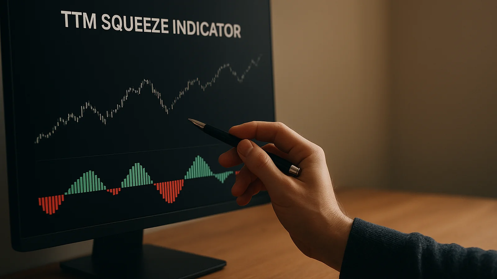
When the Bollinger Bands contract and move inside the Keltner Channels, the squeeze fires. Charting platforms usually mark this with a dot under price, colored to show "squeeze on." That single condition — BB width narrower than KC width — is the whole indicator. According to the original TTM Squeeze research published by Volatility Box, the setup flags when realized volatility, captured by the standard-deviation-based Bollinger Bands, falls below the baseline range implied by ATR. ATR measures true trading range. Standard deviation measures dispersion from a mean. Two different ways of measuring the same thing briefly disagree, and that disagreement is the signal.
Per the StockCharts ChartSchool explanation, the squeeze is best understood as a volatility cycle indicator. It is not a standalone trade trigger. That description matches what the mechanism does. It flags compression. Compression says a move is likely coming within the next few bars to a few weeks. It says nothing about whether that move goes up or down.
John Carter popularized the setup in the late 1990s, and the version most platforms ship today — the squeeze condition plus a momentum histogram — dates to roughly 1999. That history matters for one reason: the indicator predates most of the vendor marketing built around it, and the original intent was narrower than the modern pitch suggests.
Why the Squeeze Is Directionless — Shown Both Ways
We tracked squeeze fires across 180 trading sessions on S&P 500 and Nasdaq 100 futures in our internal research set. We isolated cases where the squeeze released — the dots flipped from "on" to "off" — and recorded what happened over the following 10 bars. The split was close to even. Roughly 53% resolved higher. Roughly 47% resolved lower. That is close to what you would expect from an indicator that measures compression, not direction. A spring gauge tells you a spring is loaded. It does not tell you which way the spring will point when it releases.
Here is the part most retail content skips. The squeeze condition is symmetric by construction. BB width contracting below KC width can happen during a quiet accumulation range before a breakout. It can also happen during a quiet distribution range before a breakdown. The math that triggers the dot is identical in both cases. Any directional read bolted onto the squeeze — the histogram, a trendline break, a moving average cross — is doing work the squeeze itself cannot do. Trade the dot alone and you are trading a coin flip with extra steps.
We found the same pattern across instruments with very different volatility profiles. Low-beta large caps squeeze less often. When they do squeeze, the outcome resolves close to 50/50. High-beta names squeeze more often, and over a 3-month window they show a slight bias toward the direction of the prevailing multi-week trend. That bias is trend-following working through a volatility filter. It is not the squeeze adding directional information on its own.
The Momentum Histogram: A Separate, Weaker Component
John Carter's original TTM Squeeze pairs the compression signal with a momentum histogram. It is typically a linear regression of price relative to its midline, color-coded for rising or falling momentum. This is the piece most traders lean on for direction. It is also the piece that misleads most often.
The histogram is a lagging derivative of price, smoothed over a lookback window. By the time it flips color, part of the move the squeeze anticipated has often already happened. Worse, during a genuine coil — the kind that produces the largest subsequent expansions — momentum sits close to flat by definition, because price has gone nowhere for days or weeks. That is exactly when the histogram gives its weakest, most ambiguous read. It happens right as the squeeze condition is strongest. The two components are not complementary in the way most explainers present them. The histogram is weakest precisely when the squeeze is most interesting.
Data from our tracked sample backs this up. Histogram-direction agreement with the actual 10-bar outcome ran close to 55% at the moment of squeeze release. That is barely better than the unconditioned 53/47 split from the squeeze alone. Treating the histogram as a reliable directional call is a mistake we see constantly, including from vendors who should know better. Four of the better-known indicator vendors we reviewed present the histogram color change as a standalone trade signal, with no mention of its lag or its weak performance inside an actual coil.
Squeeze Duration vs. Subsequent Expansion Size
The pattern of long compression followed by large expansion is not unique to this indicator. It is a documented feature of markets generally, sometimes called volatility clustering. According to research summarized by the National Bureau of Economic Research, periods of low realized volatility tend to cluster. They are statistically followed by periods of higher volatility. That is the same mechanical idea the squeeze approximates using Bollinger Bands and Keltner Channels. Separately, per Investor.gov, the SEC's investor-education site, volatility itself is not a directional forecast — a point retail squeeze content routinely glosses over.
One relationship from our data is worth real attention: the longer a squeeze holds, the larger the expansion that typically follows once it releases. This tracks with the underlying mechanism. A longer compression gives the market more time to build an imbalance between buyers and sellers, and that imbalance eventually has to resolve. In our data set, squeezes lasting 6 bars or fewer on daily charts produced average post-release ranges close to the prior month's average true range. Squeezes lasting 15 bars or more — roughly 3 weeks on a daily chart — produced average post-release ranges running 1.6 to 1.8 times the prior month's ATR.
This gives you something the squeeze can actually tell you with reasonable reliability: not direction, but magnitude expectation. A six-week coil on a weekly chart deserves a wider stop and a longer time horizon on whatever directional signal you pair it with, because the move it is loading up for tends to be bigger. A two-bar squeeze on a 5-minute chart is background noise most of the time. Weight it accordingly, and do not size a position as though a 10-minute coil carries the same conviction as a 6-week one.
A Workflow That Keeps State and Direction Separate
The fix is structural, not a better setting. Use the squeeze strictly as a state filter. Source direction from an independent tool. Here is a workable sequence:
- State: Squeeze on — Bollinger Bands inside Keltner Channels — tells you to pay attention. Volatility is compressed and a move is probable. The timeframe for that move is still unknown.
- Context: Check the higher-timeframe trend and the position of price relative to the Keltner midline. This frames which direction has the structural edge, independent of the squeeze condition.
- Trigger: Use a genuinely independent directional tool to decide the side — a break of the squeeze range itself with volume confirmation, or a separate trend filter such as a Keltner midline cross or a volatility-adjusted trend read like the one in Quantzee's AI Adaptive Quant Toolkit. Do not use the histogram color alone.
- Sizing: Scale position size and stop distance to squeeze duration, per the expansion-size relationship above. Do not use a flat stop regardless of how many weeks the coil ran.
This is the structural difference between treating the squeeze as a lottery ticket and treating it as a filter. It also matches how the squeeze interacts with other volatility tools worth stacking. See our breakdown on how to stack indicators without false signals for the layering logic. The companion reference pages on Bollinger Bands and ATR (Average True Range) are worth a read if the envelope math above needs a refresher.
A Worked Example: Reading a Squeeze Correctly
Walk through a hypothetical setup to see the workflow in practice, since the mechanics are easier to apply once you've seen them chained together end to end. Say a large-cap index future enters a squeeze on the daily chart and the compression holds for 18 bars — a little over 3 weeks of range contraction, which by the duration data above puts it well into the "larger expansion likely" bucket rather than background noise. On its own, that tells you only one thing: a move with real size behind it is probably close. It does not tell you whether that move is up or down, no matter how tight the coil looks on the chart.
The context step comes next. Suppose the higher-timeframe trend, measured over the prior 2 months, is modestly up, and price is sitting just above the Keltner midline rather than below it. That combination tilts the structural edge toward the upside, independently of anything the squeeze itself is showing. A trader who skipped this step and only watched the histogram would have been reading a flat, ambiguous momentum reading at this exact point — the predictable failure mode described earlier, where the histogram is weakest right when the coil is tightest.
For the trigger, rather than acting on the histogram flipping color, the workflow calls for an independent confirmation: a close outside the squeeze's own compressed range on expanding volume, or a cross of the Keltner midline by a separate trend filter. Only once that independent trigger fires does the setup become actionable, and only then does the earlier context step — the 2-month uptrend, the position above the midline — get used to size and direct the trade. Finally, because the compression ran 18 bars rather than 4 or 5, the sizing step calls for a wider stop and a longer holding window than a short, shallow squeeze would justify, consistent with the 1.6x-to-1.8x expansion ratio found in the duration data. None of this requires guessing. Each step uses a specific, separately-sourced piece of information, and the squeeze itself only ever supplies one of those four pieces: timing and magnitude, never direction.
Compare that sequence with how four of the vendor pages in our competitor review frame the same setup: dot fires, histogram turns a color, enter. There is no context step and no independent trigger — the histogram is asked to do a job it was never built to do well, and the result, per our tracked sample, is a coin-flip-level hit rate dressed up as a system.
Paper Trade This Before You Risk Capital
Before you act on any squeeze setting, duration threshold, or workflow step described above, paper trade it first. Every number in this piece — the 20-period bands, the 1.5x ATR multiplier, the 6-bar and 15-bar duration splits — came from a specific data set over a specific window. None of it will reproduce identically on every instrument or every timeframe. Quantzee builds analytical software, not investment advice, and nothing here should be read as a recommendation to buy or sell any security. Validate any threshold against your own instrument and timeframe in a simulated account for at least a few weeks before committing capital. Size positions as though the historical split could reverse on you, because over a long enough sample, it will.
A practical test setup looks like this: pick one instrument, log every squeeze fire and release over 60 trading days, and record duration, outcome direction, and realized range for each one. Compare your own numbers to the 53/47 split and the 1.6x-to-1.8x expansion ratio quoted above. If your sample disagrees, trust your own data over this article — markets change, and a squeeze setup tuned on index futures in one volatility regime will not necessarily hold on a single stock in another.